Twinkle Toes is an e-commerce store that specializes in everyone's favorite accessory: sparkley shoes.
Deployed Site can be accessed here.
Twinkle Toes is an application built using the MERN stack (i.e. a React front-end and a MongoDB + Express back-end).
The application allows customers to browse the inventory of Twinkle Toes and leave reviews on products.
Furthermore, the application gives admins full-CRUD functionality (i.e. the ability to create, read, update, and delete products from the backend).
This was the first project in which I co-coded with other software engineers. Serving as Git Manager, this project taught me how to handle the Git Workflow with a remote team.
In addition, this project was a collaboration with General Assembly's UX/UI cohort. The UX/UI team that we were paired with produced the wireframes and we were tasked with bringing them to life.
In order to achieve minimum viable product (MVP), the following functions and components are required:
-
Deploy Back-End to MongoDB using Heroku
-
Build Express Back-End
-
Full CRUD-functionality
-
Create React App with the following screens:
-
Home
-
Products
-
ProductDetail
-
ProductCreate (form)
-
SearchResults
-
-
Detailed CSS to UI/UX resemble wireframes
The following components and functionns were prioritized for post-MVP:
-
Site-wide Product Search functionality
-
Product Review Feature (Form)
-
Photo File Upload

|_db
             |_connection.js (connects to MongoDB)
|_models
             |_product.js (model for one product)
|_seed
             |_products.js (contains product seed data)
|_controllers
             |_products.js
|_routes
             |_products.js
|_client
             |_src
                  |_app.js
                  |_components
                              |_Edit
                              |_HeroCarousel
                              |_PopularCarousel
                              |_PopularProduct
                              |_Product
                              |_ReviewForm
                              |_Reviews
                              |_Search
                              |_shared
                              |_SimilarItems
                              |_Sort
                              |_StarRating
                  |_screens
                              |_Home
                              |_ProductCreate
                              |_ProductDetail
                              |_Products
                              |_SearchResults
                  |_services

                              |_apiConfig.js
                              |_products.js
                  |_utils
                              |_sort.js
Home Page

Product Gallery

Product Detail

Search Page

Add Products

The Twinkle Toes landing page includes two carousels built from scratch.

The first, known as the Hero Carousel, serves as a dynamic banner that rotates through various images at the top of the page. Users are able to cycle through these images sequentially (using the arrow icons) or nonsequentially (using the dot-shaped indicators at the bottom of the page). A pink dot indicates the hero image currently on display, whereas a white dot indicates an inactive image in the set.
The challenge was creating a function that could handle both methods of sifting through the series of hero images. Furthermore, as these slides shift, this function needs to toggle the class of active and inactive slides.
 // Below creates a set of divs containing each hero slide

  let heroSlides = heroImages.map((element, idx) => {
    return (
      <div className="invisible fade" key={idx} style={{

        width: "100vw",

        display: "flex",

      }}>
        <img src={element} alt={idx} key={idx} style={{

          width: "100%",
          height: "60vw",
          objectFit: "cover",

        }} />
      </div>
    )
  })

// Below function creates dot-shaped indicators that correspond with each slide.

  function createHeroCarouselButtons() {
    let buttons = [];
    for (let i = 0; i < heroImages.length; i++) {
      buttons[i] =
        <span className="hero-dot" key={i} onClick={() => currentSlide(i)} ></span>
    }
    return buttons
  }

// Below function allows users to shuffle through the slides either sequentially or directly.

  function showSlides(n) {

    if (n === undefined) {
      n = 0
    }

    heroSlides.forEach((element, idx) => {
      if (idx === n) {
        const selectedSlide = heroSlides[idx].props.children

        heroSlides[idx] = {
          ...heroSlides[idx], props: {
            className: "visible fade", children:
              selectedSlide
          }
        }
      }
      if (idx !== n) {
        const selectedSlide = heroSlides[idx].props.children

        heroSlides[idx] = {
          ...heroSlides[idx], props: {
            className: "invisible fade", children:
              selectedSlide
          }
        }
      }
    }
    )

    heroCarouselButtons.forEach((element, idx) => {
      if (idx === n) {
        const buttonFunction = heroCarouselButtons[idx].props.onClick

        heroCarouselButtons[idx] = {
          ...heroCarouselButtons[idx], props: {
            className: "hero-dot hero-active", onClick:
              buttonFunction
          }
        }
      }
      if (idx !== n) {

        const buttonFunction = heroCarouselButtons[idx].props.onClick

        heroCarouselButtons[idx] = {
          ...heroCarouselButtons[idx], props: {
            className: "hero-dot", onClick:
              buttonFunction
          }
        }

      }
    }
    )
    setCurrentIndex(n)
    setHeroCarousel(heroSlides)
    setHeroButtons(heroCarouselButtons)
  }

  function currentSlide(n) {
    showSlides(n);
  };

  function plusSlides(n) {
    let tempIndex = currentIndex

    if ((n === (-1)) && (currentIndex === 0)) {

      tempIndex = (heroSlides.length -= 1);

    };
    if (n === (-1) && (currentIndex !== 0)) {
      tempIndex -= 1;
    };
    if (n === 1 && (currentIndex === (heroSlides.length - 1))) {
      tempIndex = 0;
    };
    if (n === 1 && (currentIndex !== (heroSlides.length - 1))) {
      tempIndex += 1;
    };

    showSlides(tempIndex)
  };

The Popular Items Carousel highlights the highest rated products on the Twinkle Toes site. Unlike the Hero Carousel, the Popular Items Carousel displays five items cards at a time.
This carousel posed the unique challenge of keep track of the order of these item cards as users cycle through the display.
// The Below React Hooks keep track of the popular items and the range of indices on display.

  const [popularCarousel, setPopularCarousel] = useState([]);

  const { popularLowerIndex, setPopularLowerIndex } = props;
  const { popularUpperIndex, setPopularUpperIndex } = props;

// The below snippet illustrates demonstrates how the array of slides is altered using a spread operator and prevState.

  function plusSlides(n) {

    let tempLowerIndex = popularLowerIndex
    let tempUpperIndex = popularUpperIndex

    if ((n === (-1)) && (tempLowerIndex === 0)) {

      popularCarousel.pop()
      setPopularCarousel(popularCarousel)

      tempLowerIndex = (popularItemCards.length - 1)
      tempUpperIndex -= 1;

      setPopularLowerIndex(tempLowerIndex)
      setPopularUpperIndex(tempUpperIndex)

      setPopularCarousel(prevPopularCarousel => {
        return [popularItemCards[tempLowerIndex], ...prevPopularCarousel]
      });

    [...]

    };
  };

This component pictorally presents users with the rating of each item on site. Each item is scored from one (1) to five (5).
The unique challenge that this component posed was creating a function that could generate the accurate number of stars for each item.

// The below snippet illustrates how a for loop was used in combination with an if/else conditional to render the accurate number of stars with conditional formatting.

<div className="review-stars-container">
      {[...Array(5)].map((star, idx) => {
        if (idx < props.rating) {
          return (
            <span className="review-star" key={idx}><FaStar color="#F4A2B6" /></span>
          )
        } else {
          return (
            <span className="review-star" key={idx}><FaStar color="#C7C7CC" /></span>
          )
        }
      })}
    </div>
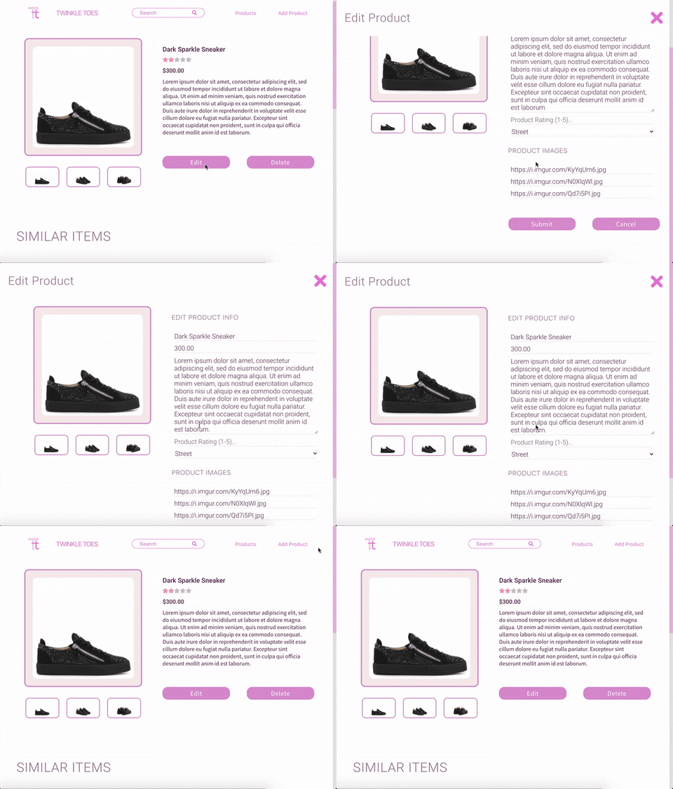
The Edit Product Modal appears when an admin wishes to alter information about a product.
The React Hook useState is employed in order to toggle visibility of the modal. When state is set to "false", the modal's "display" CSS property is set to none. When state is set to "true", the modal's "display" CSS property is set to "flex".
const [editVisibility, setEditVisibility] = useState(false);

const changeVisibility = (e) => {
  e.preventDefault();
  setEditVisibility(!editVisibility);
};

<div id="edit-products-modual" className={editVisibility ? "edit-visible" : "edit-hidden"}>

  <ProductEdit />

</div>
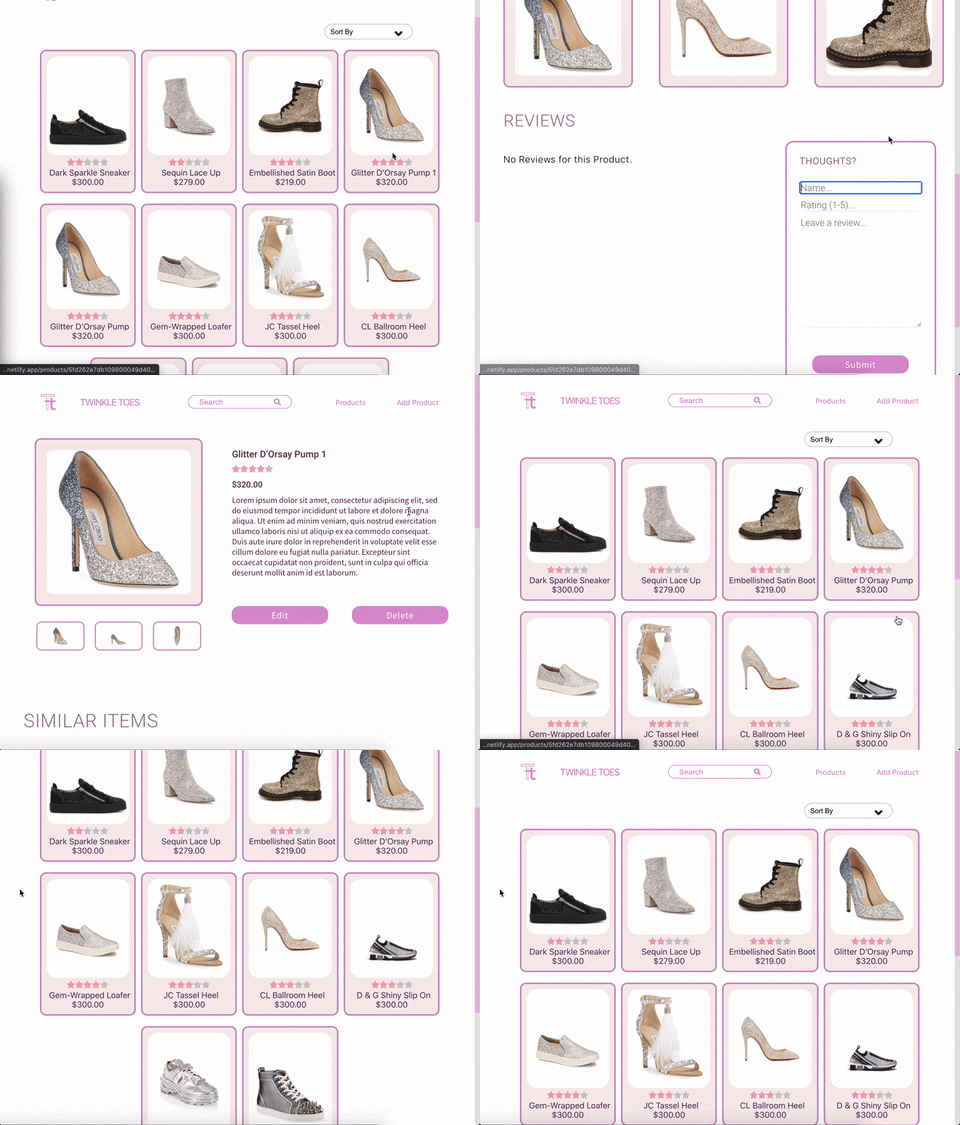
An unexpected challenge lay in the 'delete product' function. The desired functionality is as follows:
- An admin wishes to delete a specific product
- The admin navigates to that products page and clicks 'delete'
- The admin is then rerouted to the products directory, which displays all remaining products
When we first attempted to create the desired effect, we noticed an issue: the recently deleted product would continue to display on the rerouted product directory page. It wouldn't disappear until the user hit refresh.
In order to solve this issue, we used React Hook useState to create a switch that would toggle when a component is deleted.
const [isDeleted, setIsDeleted] = useState(false);
However, when placed inside the Product Detail component, the following error occurred:

After watching this incredibly helpful video by Kent Dodds on YouTube, we realized that we were almost on the right track.
Instead of placing the React Hook "switch" within the Product Detail component, we had to place it one tier above, in order to create the desired effect. Voila!

The product sort feature allows users to sort products either alphabetically or by price.
In order to create the sort util, we had to leverage our knowledge of sorting algorithms. Due to its simplicity, we used a Bubble Sorting algorithm for this application.
In addition, a sorting function was used in order to create a dynamic array of products to populat the Popular Products Carousel (see above).
const compareKey = key =>
  (a, b) => {
    if (a[key] < b[key]) {
      return -1
    }
    if (a[key] > b[key]) {
      return 1
    }
    return 0
  }

export const AZ = arr => arr.sort(compareKey('name'))
export const ZA = arr => arr.sort(compareKey('name')).reverse()
export const lowestFirst = arr => arr.sort((a, b) => parseInt(a.price) - parseInt(b.price))
export const highestFirst = arr => arr.sort((a, b) => parseInt(b.price) - parseInt(a.price))
export const lowestRatingFirst = arr => arr.sort((a, b) => parseInt(a.admin_rating) - parseInt(b.admin_rating))
export const highestRatingFirst = arr => arr.sort((a, b) => parseInt(b.admin_rating) - parseInt(a.admin_rating))

To optimize the layout for mobile browsers, we created a hamburger menu.
The hamburger menu declutters the navigation bar by condensing options visible to the user. If a user wishes to navigate to a specific section of the site, they can do so by clicking on the menu icon and expanding the drop down menu.
const [menuVisibility, setMenuVisibility] = useState(false);

<div id="mobile-menu" className={menuVisibility ? "mobile-menu-visible" : "mobile-menu-hidden"}>

  <Link className="mobile-products-link" to="/products">Products</Link>

  <Link className="mobile-add-products-link" to="/add-product">Add Product</Link>

</div>