I learn the frontend skills by building a YouTube clone with React.js. This website is responsive and supporting dark mode.
Demo site: https://video-website-chi.vercel.app/
Install and run:
npm install
npm run dev
Visit http://localhost:3000 to view my project.
In order to create a fake API easily, I create this project by Next.js and put some fake API under pages/api/*.
There are two key features:
- Responsive. I design my project with the mobile-first mindset to make it responsive on mobile, tablet and desktop.
- Dark mode.
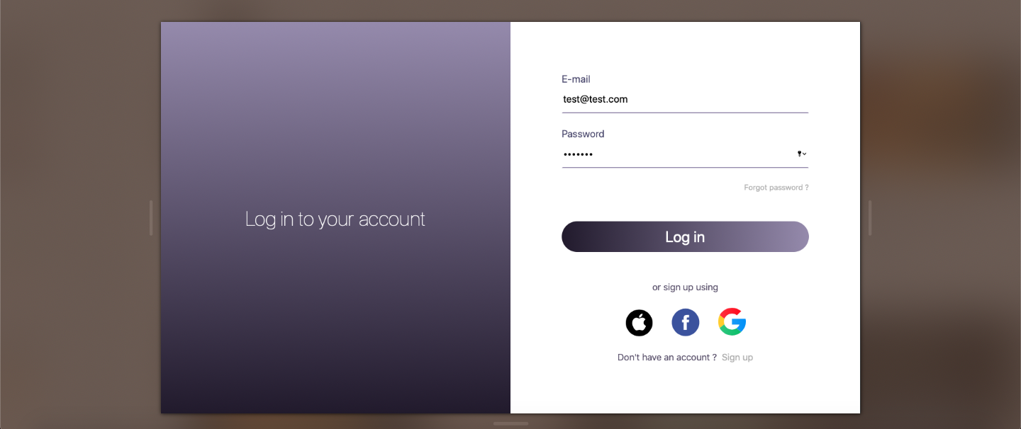
- The email and password are both required.
- I use built-in HTML5 form validation to verify input values. The page will be redirected to the home page by Next.js router after clicking the login button.
- Forgot password link, social media buttons and sign up link are just mockups.
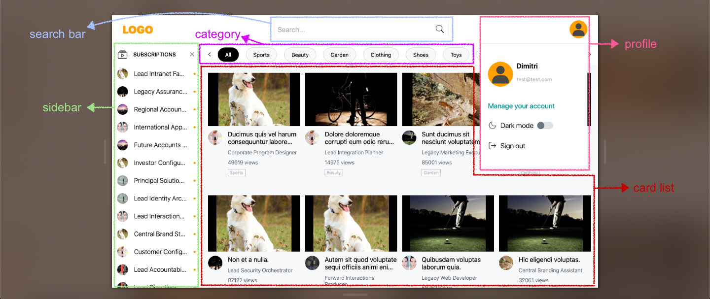
The homepage is composed of these components: profile, search bar, sidebar, category and card list.
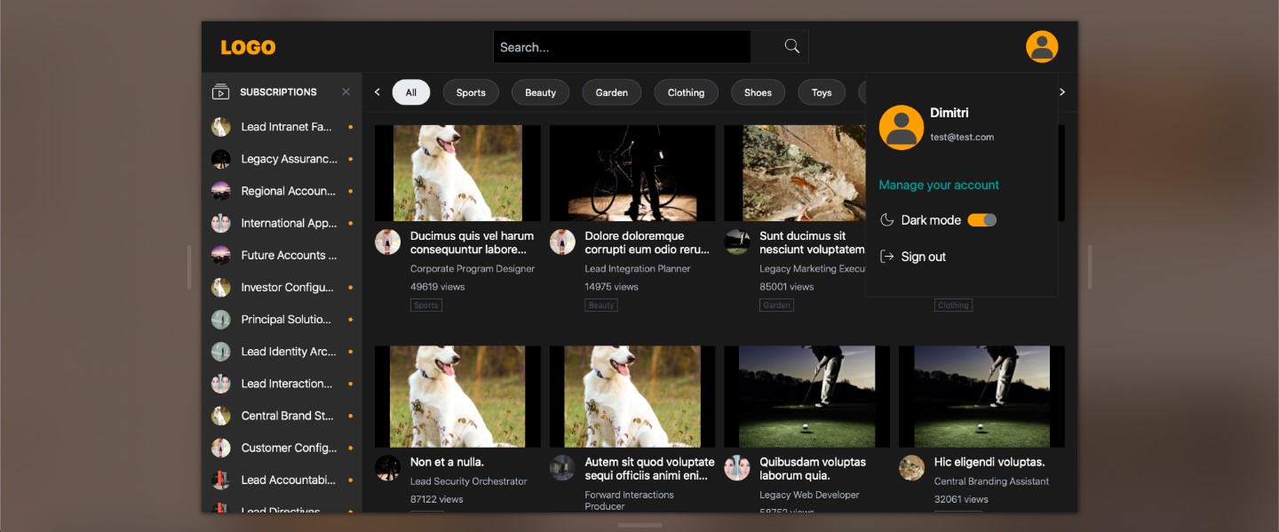
- Email: email is from the input value of the login page that is stored in Next.js router object.
- Manage your account link: It's just a mockup.
- Dark mode toggle button: The color palette theme is defined in React.js
Context. Instead of pure dark, I use dark gray as background color since light text on dark gray background has less contrast. It reduces eye strain and avoids looking jarring. - Sign out link: It redirects to the login page.
- Search by title and channel name of the videos.
- A reset button to clear your input.
- On mobile devices, the input field is hidden by default. It will be expanded when you click the search button.
- Click the arrow button on the left side to hide the input field again.
- The subscribed channels are listed in the sidebar.
- The sidebar will be collapsed or expanded depending on the width of the window. In order to display completed subscriptions on tablet and mobile phone, the whole page will be overlaid with the expanded sidebar.
- I implement
debouncefunction to avoid unnecessary re-render when the user adjusts window size too frequently. - There's a small dot to represent unread channel events.
- Channel links are just mockups.
There are two ways to scroll the category list.
- Default scroll bar.
- Click the arrow icons to scroll the list. They control the position by changing the
scrollLeftvalue.
- CSS layout is set by
display: gridfor desktop and tablet view. - For mobile view, use
display: flexto render 1 card per row.