You signed in with another tab or window. Reload to refresh your session.You signed out in another tab or window. Reload to refresh your session.You switched accounts on another tab or window. Reload to refresh your session.Dismiss alert
This file contains hidden or bidirectional Unicode text that may be interpreted or compiled differently than what appears below. To review, open the file in an editor that reveals hidden Unicode characters.
Learn more about bidirectional Unicode characters
✅ Problem: Users may not be aware of their color blindness type. Instead of viewers just experimenting with different types of color blindness, We could instead find their type .
ℹ️ About the PR TODO: To add a webpage to find their type, make them understand each of the type....
I've added support for color blindness identification, which helps users know their types.
Description of the Change
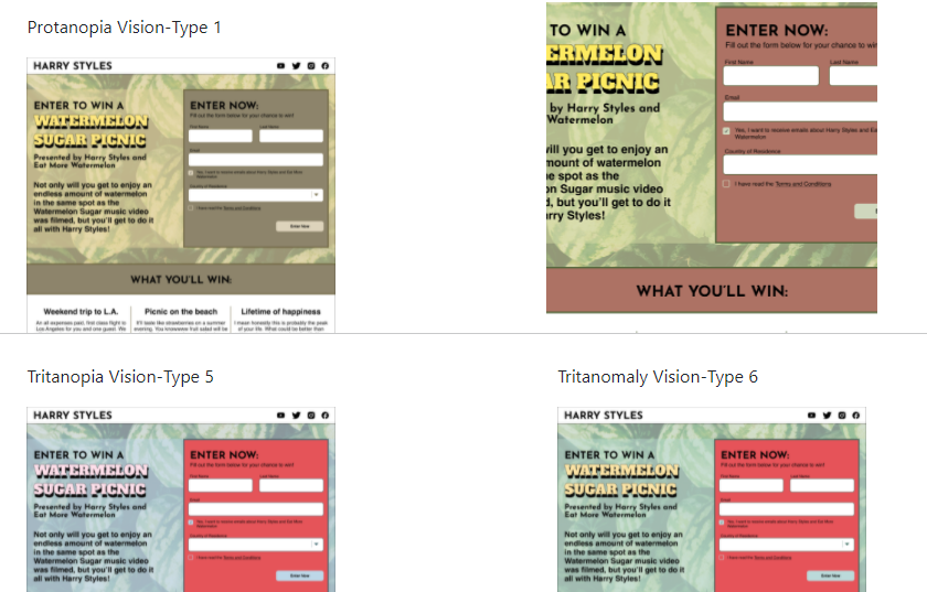
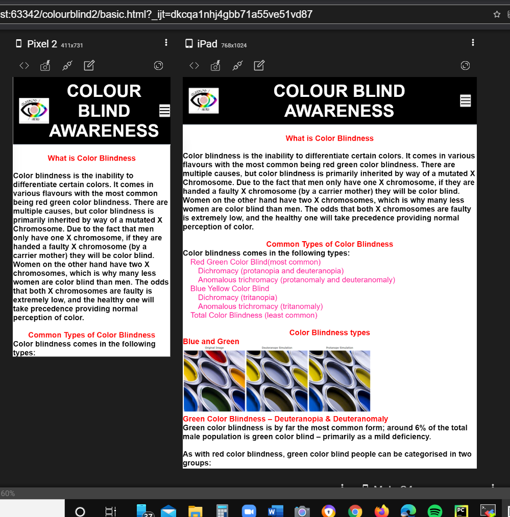
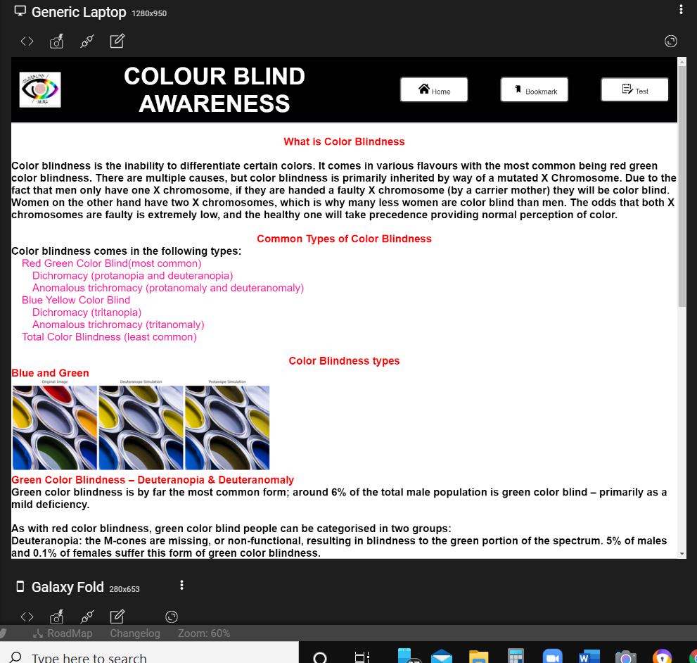
It includes one main picture [Original design] as seen by people without any color blindness and remaining 8 for 8 different color blind deficiencies. ...
Viewers can match the original with the rest 8 pictures and know their type. This is an easiest alternative to the most famous Ishihara test.
Benefits
testcolourblind.html is added to this codebase to attract larger audiences. The current state of the codebase has only the specific feature of getting access to any type of colour combinations according to 8 different types of color blindness.
Users would just be experimenting with the bookmarklet , which is why I have added an html file to make them understand what each type actually is.
This not only increases the time spent by viewers on our webpage, might also attract more viewers and hence be more useful and make this popular.
Verification Process
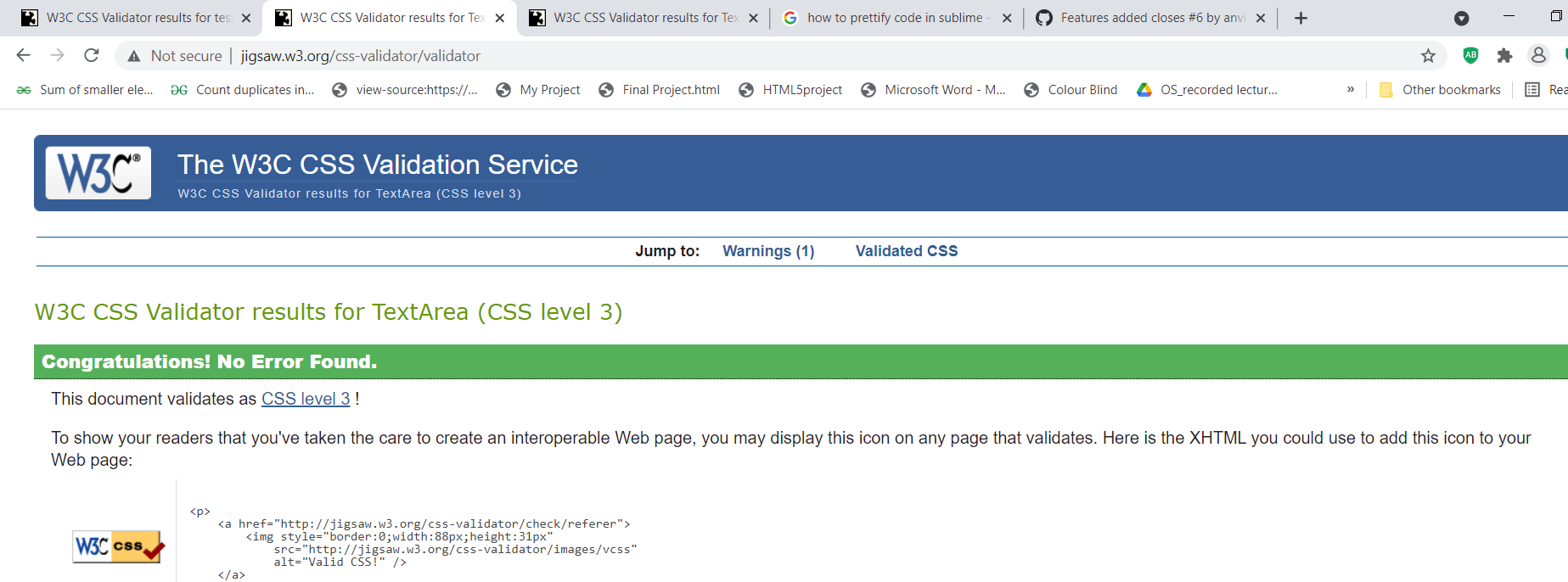
Running this page through the W3 Validator and it should not return any errors .
Checklist:
My code follows the code style of this project.
My change requires a change to the index.html code too as it adds extra features.
I made sure it is responsive code over various devices.
Made it user friendly.
I have added tests to cover my change.
All new and existing tests passed.
👀 This PR also resolves further issues and takes care of other features needed also later on. ☺️
Test Case: Let’s take Protanopia for example:
The values are: Normal:{ R:[100, 0, 0], G:[0, 100, 0], B:[0, 100, 0]},
Protanopia:{ R:[56.667, 43.333, 0], G:[55.833, 44.167, 0], B:[0, 24.167, 75.833]},
‘R’, ‘G’, and ‘B’ contain array’s of the corresponding Red, Green, and Blue values for each Channel.
So, for the Red Channel -we’d shift the Red Value up 56.667% (from the default position), and Green we’d shift up 43.333%… and since the last value is zero, we don’t change the Blue Value. This makes the red ortion appear brownish.Same happens with the green area, the red part in the Green Channel is also shifted resulting it in brownish appearance. This helps people realize the fact that people with protanopia are unable to perceive any ‘red’ light, and are more likely to confuse Dark brown with dark green, dark orange and dark red
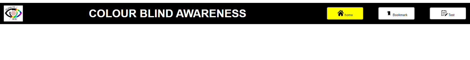
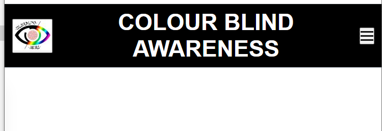
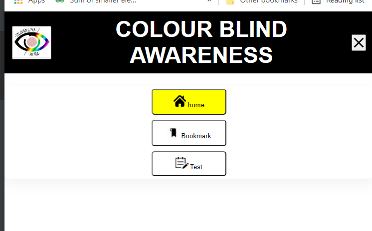
Since a new webpage is added, a navbar would be nice....
I always wondered why is necessary all of a sudden now, but then realized that maybe multiple web pages coming in...So there is a necessity of this now.
The hamburger menu is one of the examples used to build a responsive navbar (I see it practiced very often).
But using it with screen reader or only our keyboard makes us experience some of the problems as well. I have also seen the trend to use a hamburger menu on large screens – while this may look fancy – it means that users have to click two times to go to one of the listed pages. Hence I personally don't prefer this at all. So, if there is space, it is better to directly show all navigation items and only hide them behind the hamburger toggle on small screens.
Many use the Unicode sign for 'IDENTICAL TO' (U+2261) or the one for 'TRIGRAM FOR HEAVEN' (U+2630) to visually show the three lines. The first problem with this approach of showing the icon is, that not all browsers support these Unicode signs and also not all fonts do, which means these users will see a square □ (also called tofu or replacement Glyph instead of the three lines. The bigger problem with this approach is that screen readers may announce the U+2630 sign as "the trigram for heaven"....
Still, many people sadly use span or div or a for the toggle button, we should use a real button . So later on, the span maybe used to get in some animation when the mobile view is active .
Validating the webpages for errors in webpages created above...
Add this suggestion to a batch that can be applied as a single commit.This suggestion is invalid because no changes were made to the code.Suggestions cannot be applied while the pull request is closed.Suggestions cannot be applied while viewing a subset of changes.Only one suggestion per line can be applied in a batch.Add this suggestion to a batch that can be applied as a single commit.Applying suggestions on deleted lines is not supported.You must change the existing code in this line in order to create a valid suggestion.Outdated suggestions cannot be applied.This suggestion has been applied or marked resolved.Suggestions cannot be applied from pending reviews.Suggestions cannot be applied on multi-line comments.Suggestions cannot be applied while the pull request is queued to merge.Suggestion cannot be applied right now. Please check back later.
✅ Problem: Users may not be aware of their color blindness type. Instead of viewers just experimenting with different types of color blindness, We could instead find their type .
📓 Referenced Issue
Fixes #6
ℹ️ About the PR
TODO: To add a webpage to find their type, make them understand each of the type....
I've added support for color blindness identification, which helps users know their types.
Description of the Change
It includes one main picture [Original design] as seen by people without any color blindness and remaining 8 for 8 different color blind deficiencies. ...
Viewers can match the original with the rest 8 pictures and know their type. This is an easiest alternative to the most famous Ishihara test.
Benefits
testcolourblind.html is added to this codebase to attract larger audiences. The current state of the codebase has only the specific feature of getting access to any type of colour combinations according to 8 different types of color blindness.
Users would just be experimenting with the bookmarklet , which is why I have added an html file to make them understand what each type actually is.
This not only increases the time spent by viewers on our webpage, might also attract more viewers and hence be more useful and make this popular.
Verification Process
Running this page through the W3 Validator and it should not return any errors .
Checklist:
👀 This PR also resolves further issues and takes care of other features needed also later on.
☺️