Color gradient along horizontal axis rather than the vertical axis #70
Description
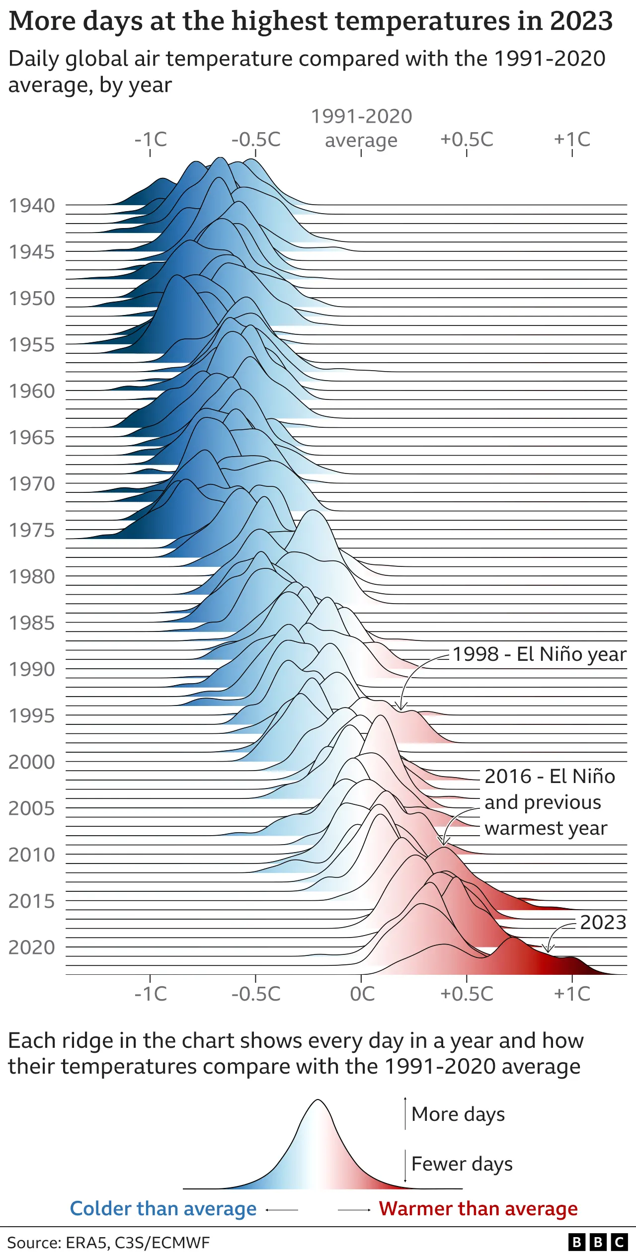
It seems joypy was used to create this prominent figure copied below: https://ichef.bbci.co.uk/news/1536/cpsprodpb/1216F/production/_132259047_global_temp_delta_1991_2020avg_multiple_ridges_v2-2x-nc.png.webp
In it, the colormap gradient runs along the horizontal axis of each individual filled KDE plot, rather than along the vertical axis which is what happens by default when you pass a colormap into joyplot. How can you achieve this with joypy.joyplot?
