New CW UI wastes a lot of space on mobile #2747
Description
This is how the new CW UI on my mobile (note that I'm already using a phone with a very big screen) looks:
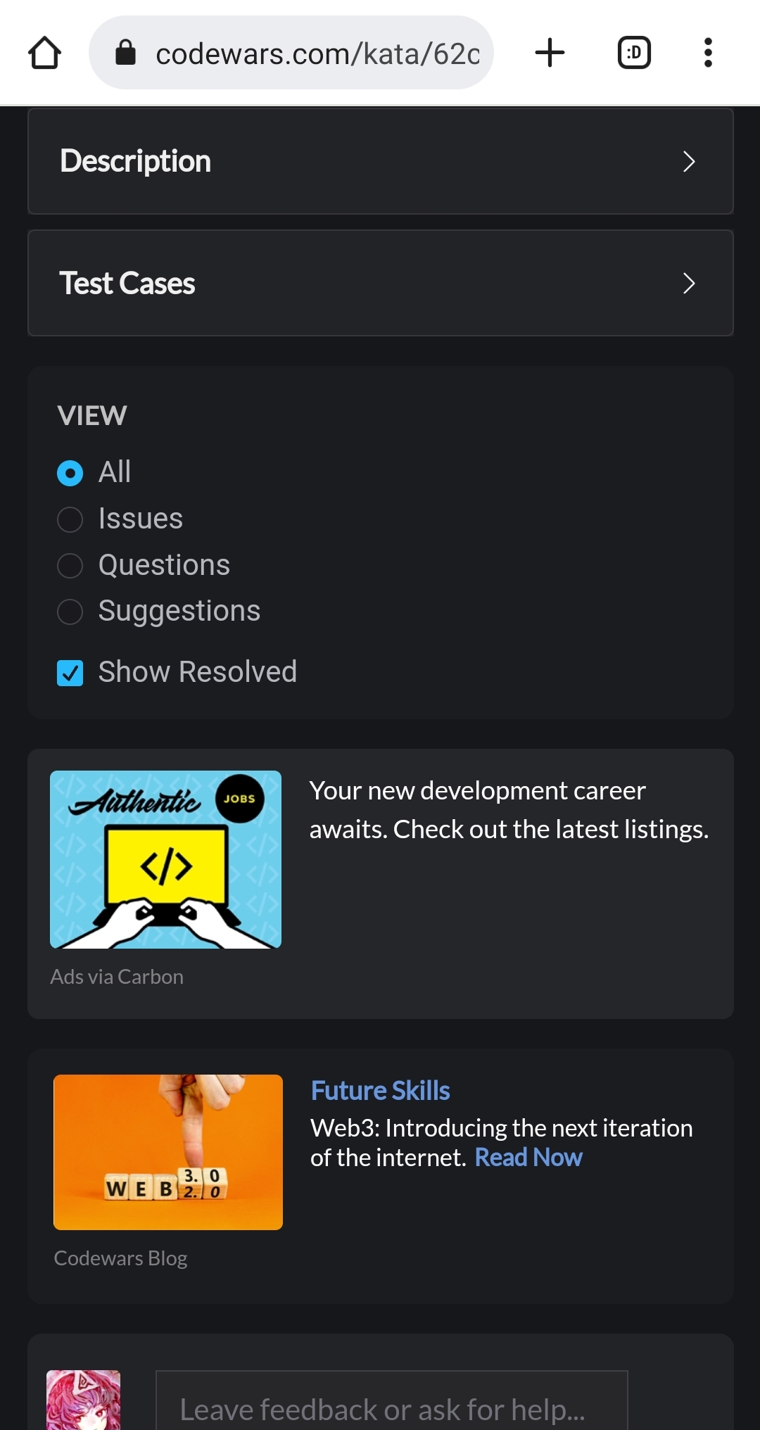
These encompasses my experience on various pages on mobile, which is an overall massive bloat of space:
- The Carbon ads + Job Opportunities already occupies half of the screen
- Lots of other stuff also occupies a big part of the screen, such as beta ranking widget (1 screen), comment/solution filtering widget (1 screen), "Test"/"Solution" tab (0.5 screen)
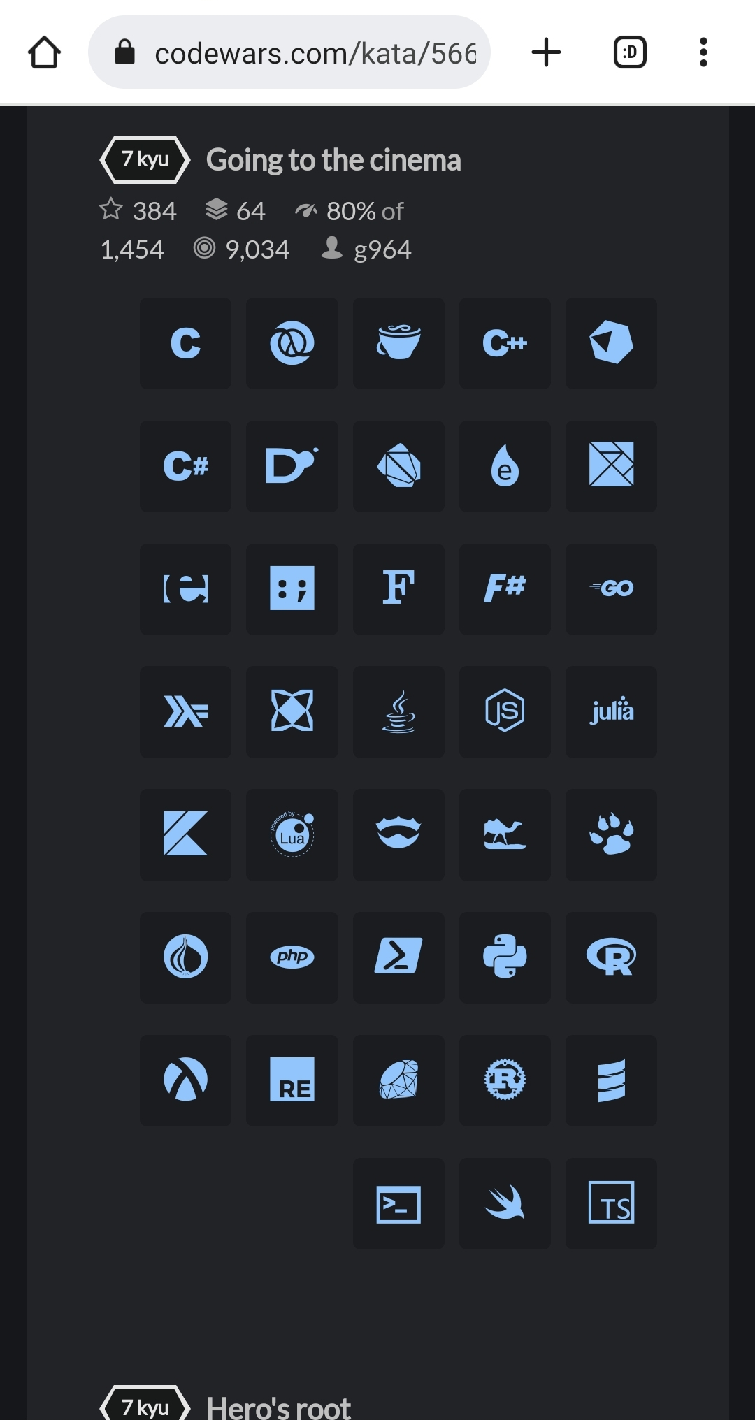
- Katas with a lot of langauges (like 30-40 languages) can easily occupied an entire screen on their own
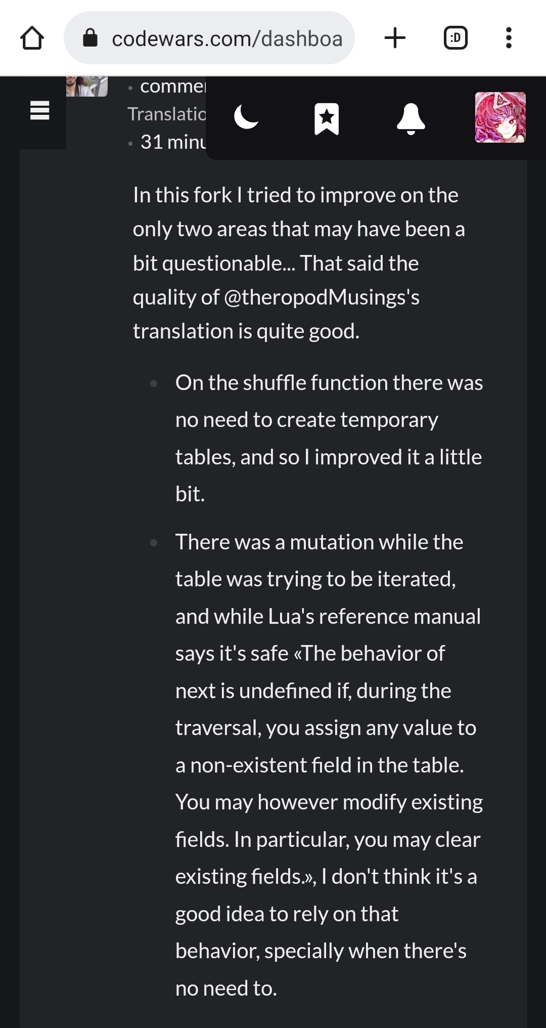
- Body/content font size and line height is absolutely bloated, along with excessive right margin; they collectively cause comments and descriptions to span a ton of space while not making it any easier to read
Currently trying to read anything on CW with mobile is a pain for (but not limited to) the abovementioned reasons. I'd rather read comments off my notification emails instead, which is at least at a more typical font size/line height and actually feels compact.
The left nav bar and its content actually looks very nice on mobile; why can't the page themselves be like the same?