[UI]: Underline from Slack and GitHub links should be removed #80
Description
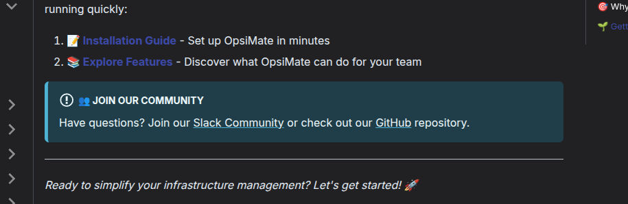
Describe the UI issue
On the Welcome page, in the "Join Our Community" section at the bottom of page, the Slack and GitHub links are currently underlined even when not hovered over.
This makes the section look a bit cluttered and less polished.
It would look cleaner if:
- The underline is removed by default.
- The underline appears only on hover with a smooth ease-in-out transition.
- The link text is slightly bolder to maintain emphasis without the underline.
Screenshots